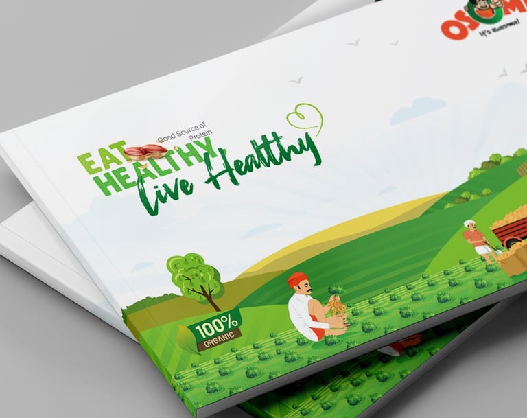
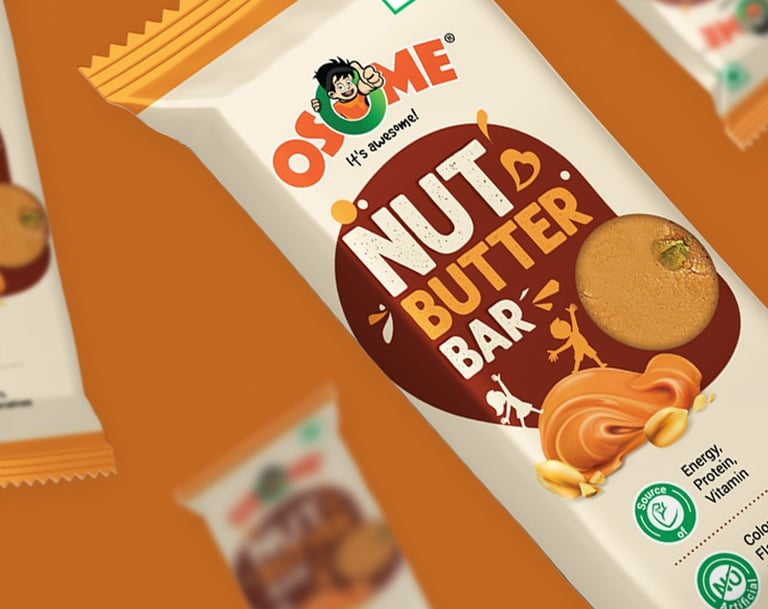
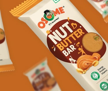
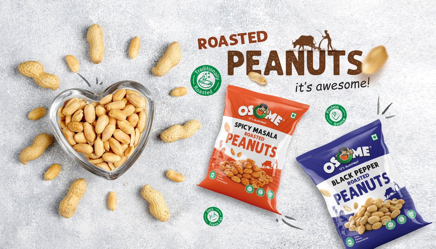
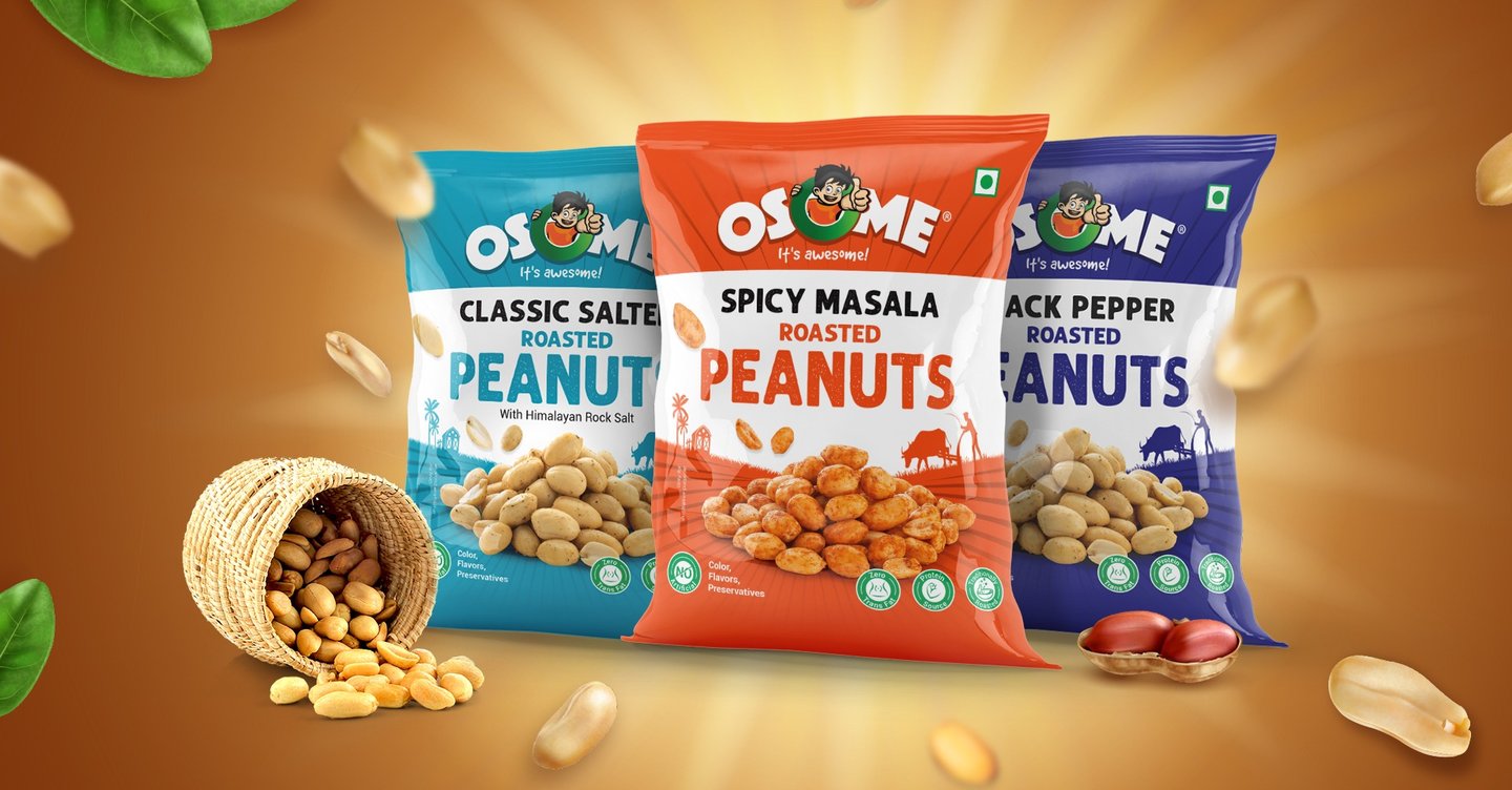
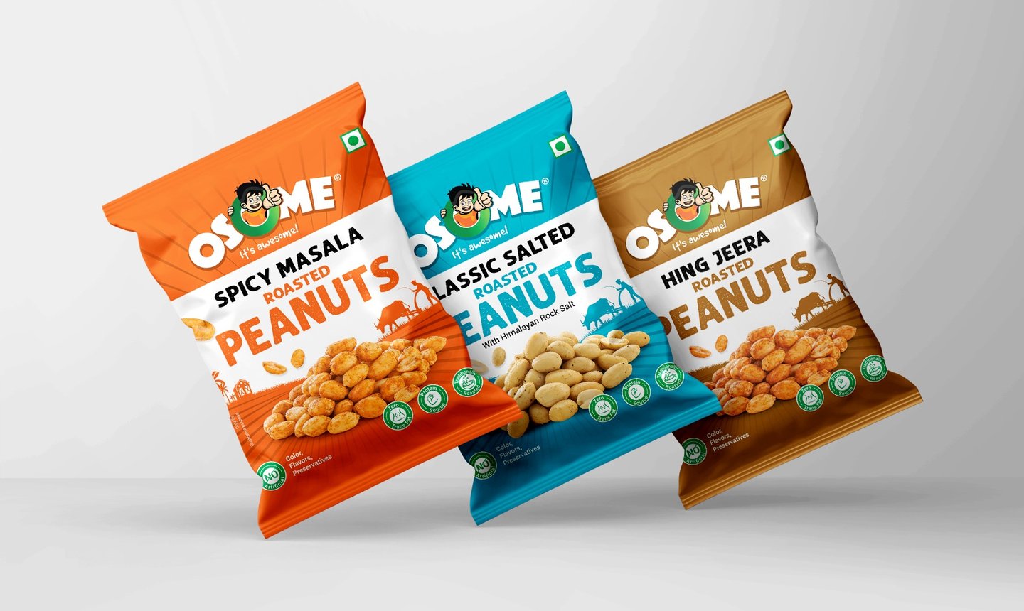
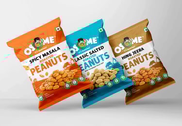
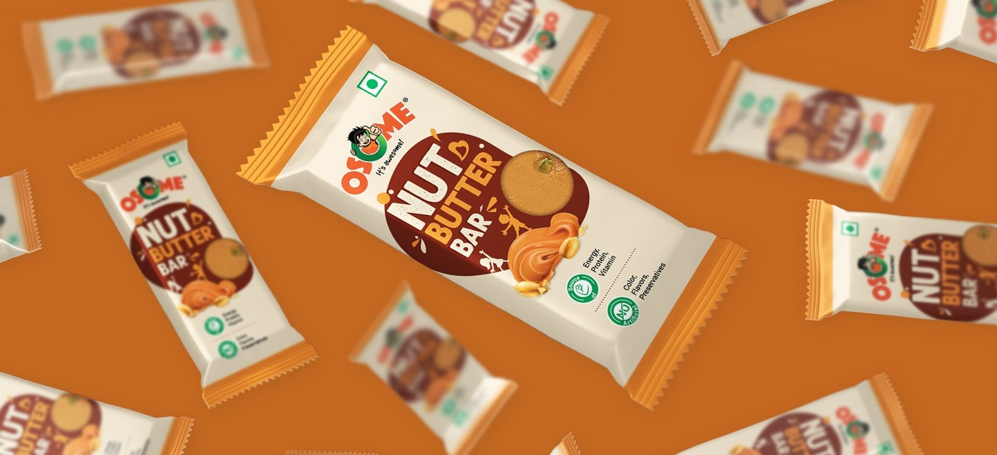
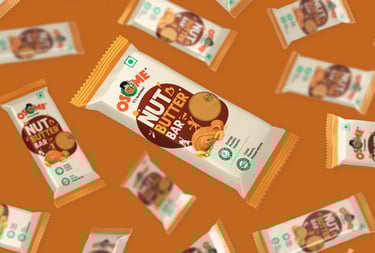
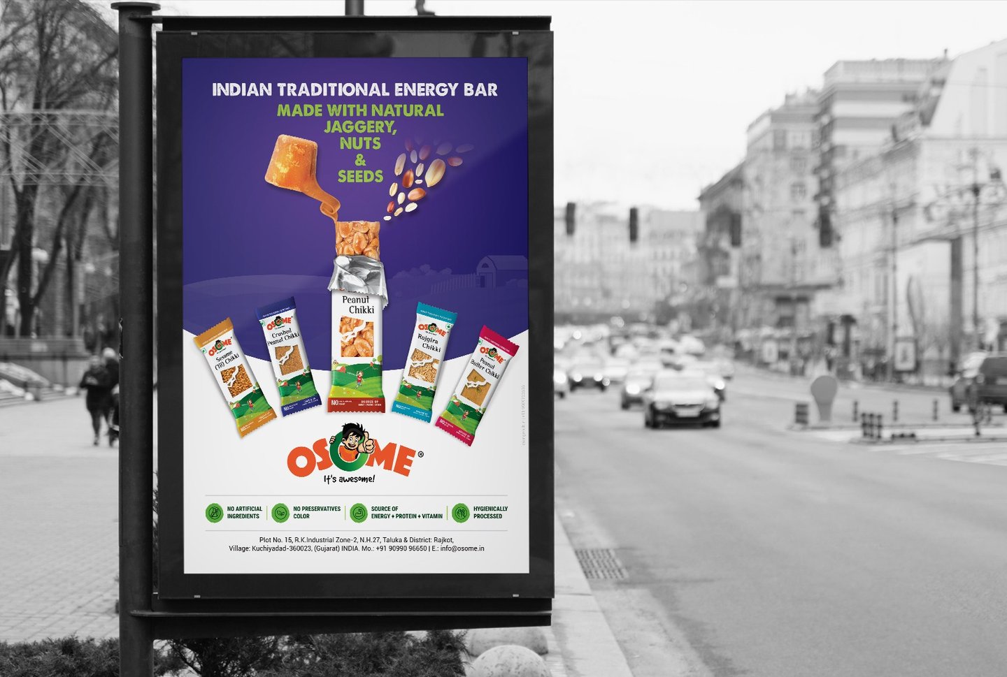
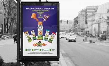
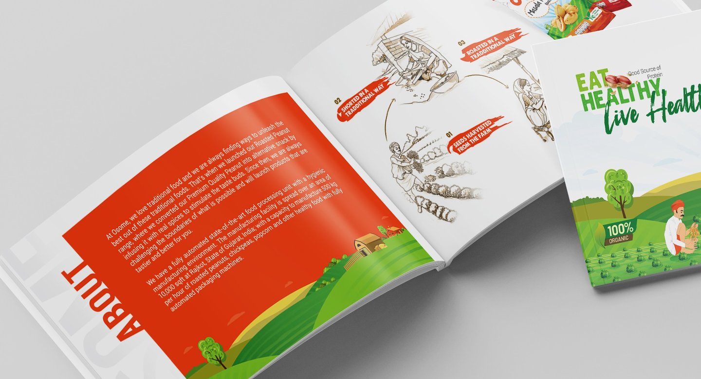
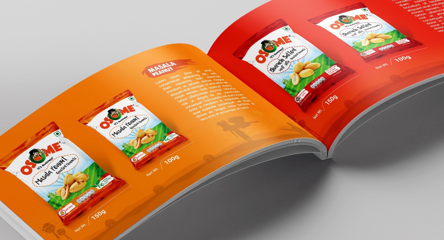
Osome is a modern Indian snack brand bringing back the joy of traditional flavors with a contemporary twist. Specializing in roasted peanuts, nut butter bars, and chikkis made with natural jaggery, Osome emphasizes health, taste, and authenticity.
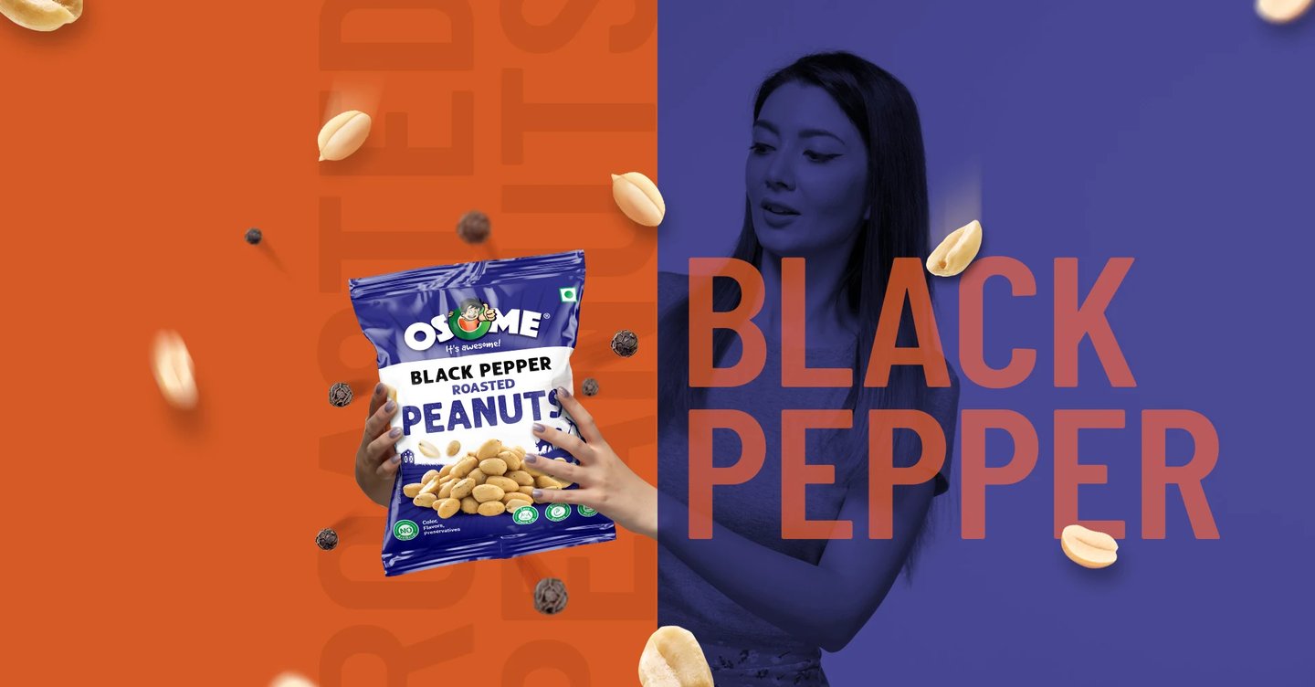
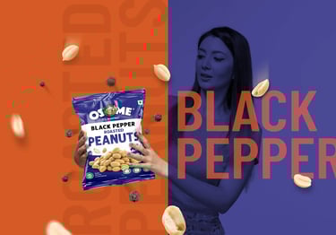
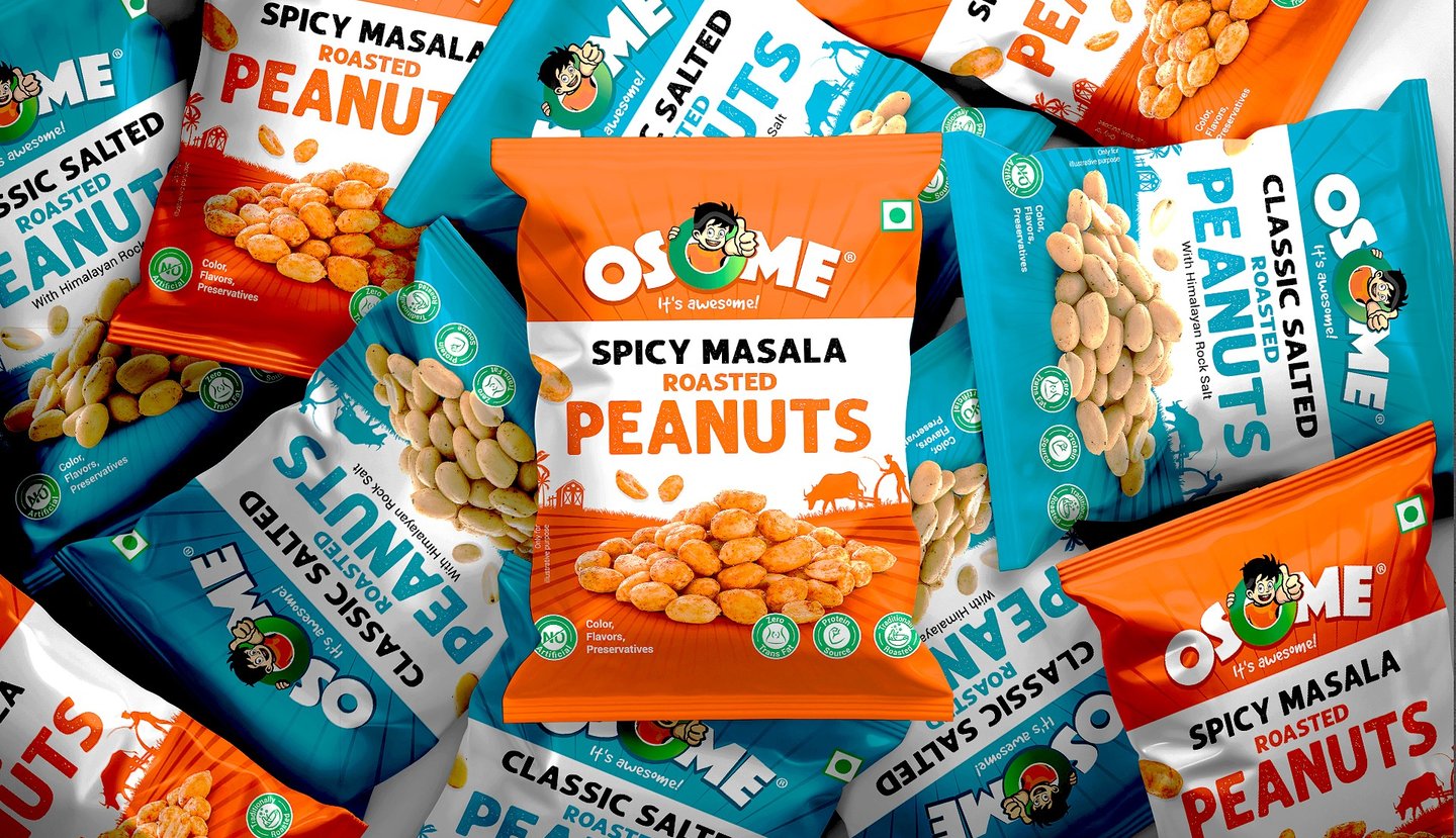
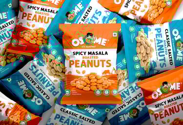
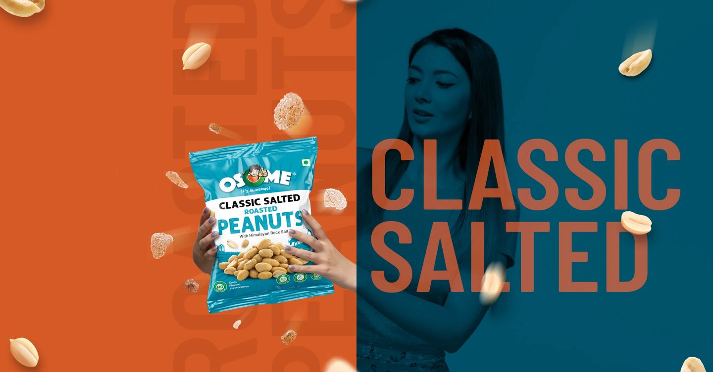
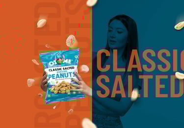
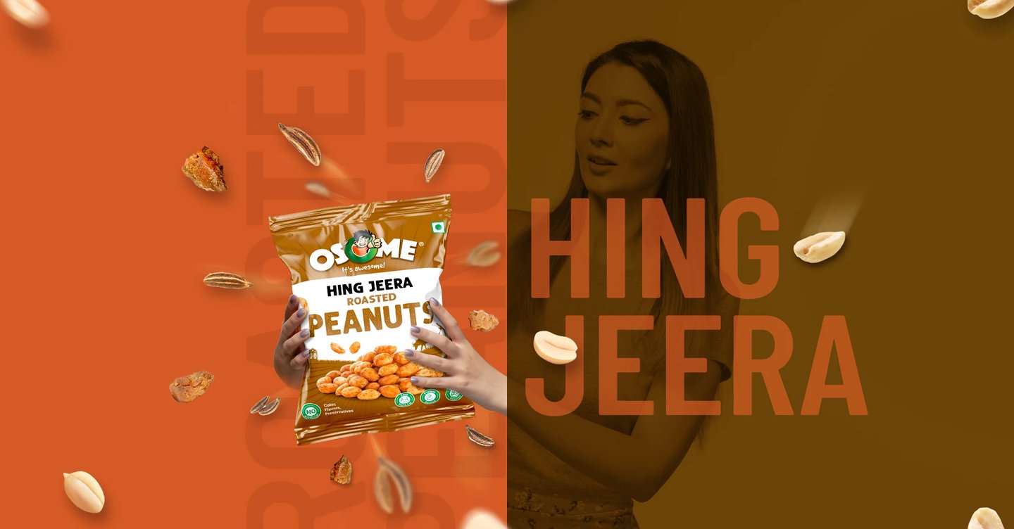
This project involved a complete branding and packaging strategy to position Osome as a youthful yet trustworthy snack choice. The visual identity reflects vibrancy, freshness, and energy, aligning with the brand’s tagline “It’s Awesome!” The color palette is bold and engaging, designed to stand out on retail shelves and appeal to a wide audience, from children to adults.
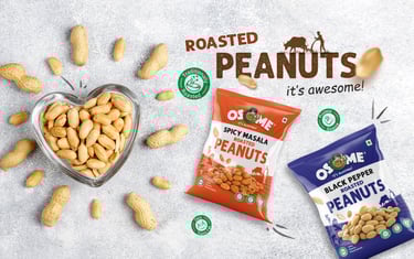
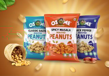
The packaging design highlights key product benefits protein-rich, zero preservatives, zero trans fat, hygienically processed ensuring strong consumer trust and market differentiation. Each flavor variation was carefully color-coded for instant recognition and shelf impact.
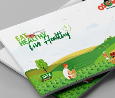
Marketing materials, including outdoor ads, social media creatives, brochures, and print collaterals, were developed to strengthen brand recall and communicate Osome’s promise of healthy snacking. Additionally, corporate stationery and identity elements were designed to maintain consistency across all brand touchpoints.
With a cohesive branding approach, Osome stands out as a fun, healthy, and reliable Indian snack brand, bridging the gap between tradition and modern snacking habits.
Our Instagram
Follow us on Instagram for branding insights, design inspiration,
and project highlights.